

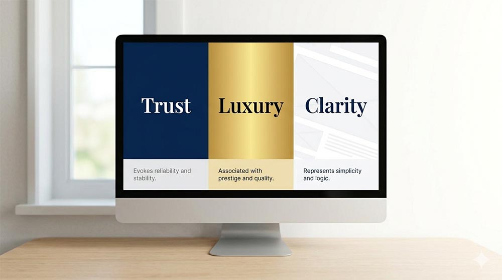
Have you ever wondered why a “Buy Now” button is often a vibrant orange, or why a healthcare site feels so calming in soft blues and whites? It isn’t just a matter of personal taste; it’s Color Psychology. At Your Biz WebDesign, we don’t just pick colors that look “nice”, we choose palettes that strategically guide your visitors toward taking action.
Here is how the right colors can impact your business’s bottom line:
1. Building Instant Trust with Blue
Blue is the most popular color for corporate and professional websites. It evokes feelings of stability, trust, and intelligence. If you are in finance, law, or consulting, a navy or royal blue tells your visitor they are in safe hands.
2. Creating Urgency with Red and Orange
Red and orange are “high-energy” colors. They physically increase heart rates and create a sense of urgency. This makes them perfect for call-to-action (CTA) buttons, clearance sales, or food-related businesses where you want to stimulate an appetite for your services.
3. The Sophistication of Black and Gold
If your brand is a luxury service, black and gold suggest elegance, prestige, and high quality. We often use these for high-end boutique sites or premium service providers looking to justify a higher price point.
4. White Space: The “Clarity” Color
Often overlooked, white (or “negative space”) is one of the most powerful tools in our design kit. It gives your content room to breathe, reduces cognitive overload, and makes your site feel modern and organized.
The Your Biz Strategy: We analyze your target audience before we ever open a color wheel.
Your brand’s colors should reflect who your customers are and how you want them to feel the moment they land on your page.
Ready to Find Your Brand’s True Colors?
If your current website feels “off” but you can’t quite put your finger on why, it might be a color mismatch. Let Your Biz WebDesign help you refresh your look with a palette designed to convert.
Contact us today for a design consultation!
