

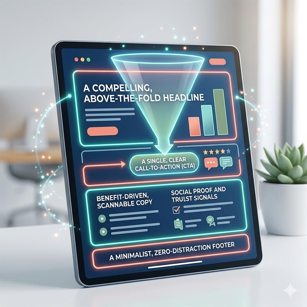
In a well-designed greenhouse, the pathway is intentional. You don’t wander aimlessly; the layout effortlessly guides you from the entrance past the seedlings straight to the mature, vibrant plants. A high-converting landing page works exactly the same way. It is a digital pathway designed with a single, laser-focused purpose: to guide a visitor toward a specific action without any distractions along the way.
If your landing page isn’t growing your email list or generating leads, it might be missing core structural elements. Here is the anatomical breakdown of a page engineered to convert:
1. A Compelling, Above-the-Fold Headline
Your headline is the hook. Within three seconds of landing on your page, a visitor needs to know exactly what you offer, how it solves their specific problem, and what they stand to gain. Keep it bold, clear, and positioned “above the fold” so they don’t have to scroll to understand your value.
2. A Single, Clear Call-to-Action (CTA)
A high-converting landing page is not the place to showcase your entire business. Total focus is key. Whether your goal is a newsletter sign-up, a free consultation book, or a product purchase, feature one primary CTA. Make the button pop with a contrasting, high-energy color that practically begs to be clicked.
3. Social Proof and Trust Signals
People buy what other people trust. Seamlessly integrate screenshots of glowing reviews, client testimonials, or industry badges just below your main sections. Seeing that your business has successfully helped others lowers a new visitor’s natural skepticism instantly.
4. Benefit-Driven, Scannable Copy
Paragraphs of dense text will kill your conversion rate. Instead, break your offer down into digestible bullet points. Focus heavily on the benefits your customer will experience, rather than just listing the technical features of your service.
5. A Minimalist, Zero-Distraction Footer
On a standard website page, your footer is packed with links to your about page, social media, and archives. On a dedicated landing page, strip all of that away. Remove the main navigation menu and keep the footer minimal. You want only two paths for the visitor: convert or close the tab.
The Bottom Line:
A landing page isn’t just a shorter website page; it is a psychological funnel.
By removing digital weeds like unnecessary links and chaotic layouts, you create a seamless, frictionless path that turns curious browsers into confident buyers.
Ready to grow your conversion rates?
Don’t let poor page structure choke out your digital marketing efforts. At Your Biz WebDesign, we excel at engineering high-performance landing pages using robust frameworks like WPBakery and clean WordPress code. Let’s design a custom page that maximizes your advertising dollars and scales your business.
